
RKLB Daily — Mapping Possibilities, Not Predicting the Future
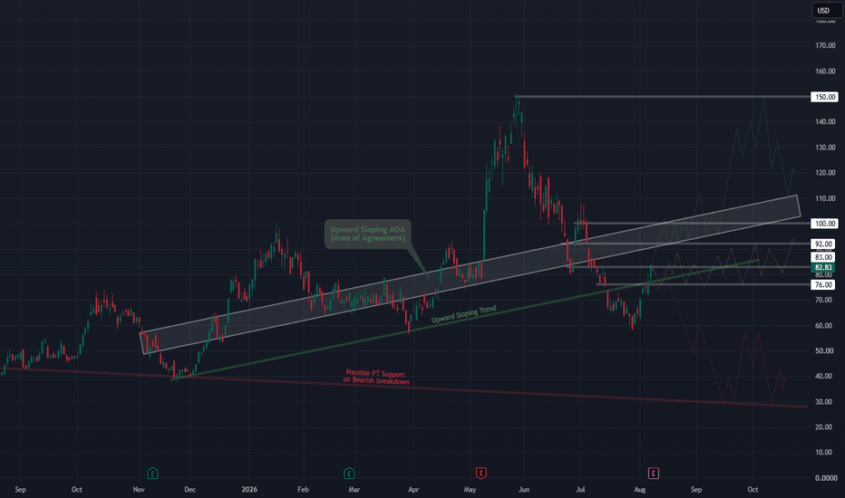
Technical analysis gets funny for me depending on the timeframe.
On 15-minute and hourly charts, I can usually get pretty close to how structure develops. Go much shorter and things get considerably harder. Go out to the daily chart like this one and I tend to land at one of two extremes: either uncomfortably close or so far off I look like an idiot.
That’s also why I don’t really use charts like this as predictions.
I use them to map possibilities.
The purpose is to identify the structures and levels that could matter ahead of time so that, regardless of what RKLB ultimately does, I’m not encountering those areas for the first time while trying to make a decision on a 3-, 5-, or 15-minute chart.
What I’m watching
RKLB is currently sitting around an interesting intersection of longer-term structure.
I have several horizontal Areas of Agreement marked around $76, $83, $92 and $100, along with the wider upward-sloping AOA shown on the chart.
Those aren’t automatic buy or sell levels.
They’re reference points.
If price reaches one of them, I can drop down into the smaller timeframes and ask a much better question: How is price actually behaving here?
Acceptance, rejection, consolidation, momentum, loss of structure—all of that becomes more useful when I already know where I care about seeing it.
Bullish possibility
The constructive path would be RKLB continuing to recover, working its way back through the nearby AOA levels and eventually reclaiming the wider rising structure.
If that develops, $92 and $100 become particularly interesting areas to me.
Above there, the old highs around $150 remain an obvious major reference point.
That does not mean I’m predicting a move to $150. It simply gives me a framework for where price could encounter increasingly important decisions if the bullish structure continues rebuilding.
Neutral possibility
There’s also nothing saying RKLB has to make some dramatic directional move from here.
Price could spend considerable time rotating between these Areas of Agreement, particularly roughly between the $76-$92 region, while the larger structure sorts itself out.
That scenario might be less exciting, but from a trading standpoint it may actually be extremely useful to recognize.
Bearish possibility
Failure to maintain the current recovery would put the lower structure back into play.
The area around $60 is one of the first places I would become especially interested again from a longer-term perspective.
A much larger structural failure opens the possibility of price eventually revisiting the lower long-term trend area near $30.
Again: possibility, not prediction.
Why I bother doing this
These daily charts serve two purposes for me.
First, they give my shorter-timeframe trading context. Instead of discovering an important level while I'm already in a trade, I've mapped it beforehand.
Second, they help me think about longer-term investment loading.
If I were already building a long-term RKLB position, for example, the two major areas I would personally have marked for additional consideration are roughly $60 and $30. Whether I actually added there would depend entirely on what the structure looked like if and when price arrived.
That distinction matters.
The lines aren't decisions. They're places where decisions may eventually need to be made.
For me, that’s the real value of this kind of higher-timeframe TA: not trying to prove that I know what happens next, but making sure very few reasonable outcomes can catch me completely by surprise.
I’ll do some TA on the shorter timeframes next. I wanted to share the daily view first because it gives you more context for how I’m thinking about the larger structure and why some of these levels matter when I eventually zoom in.

